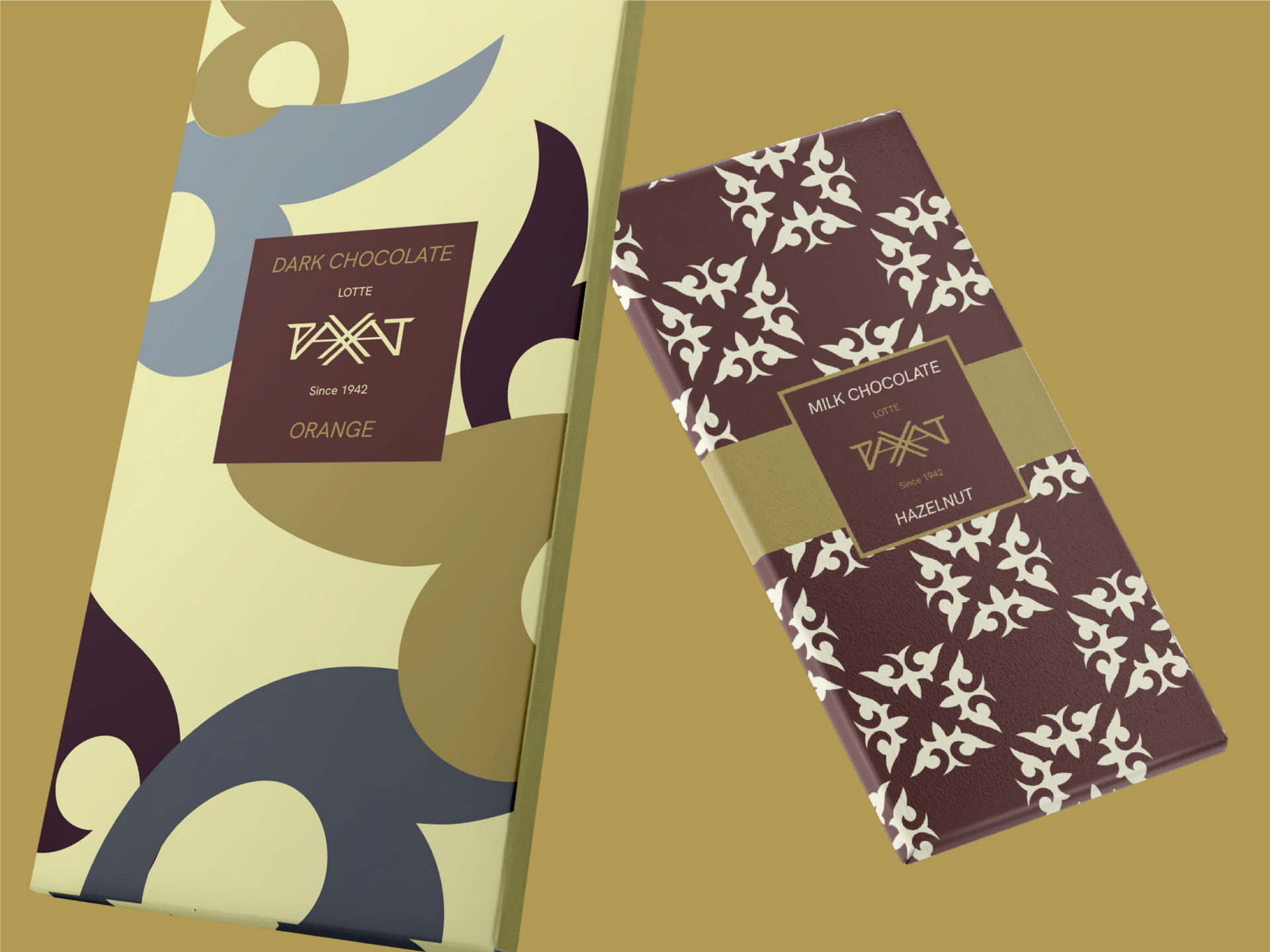
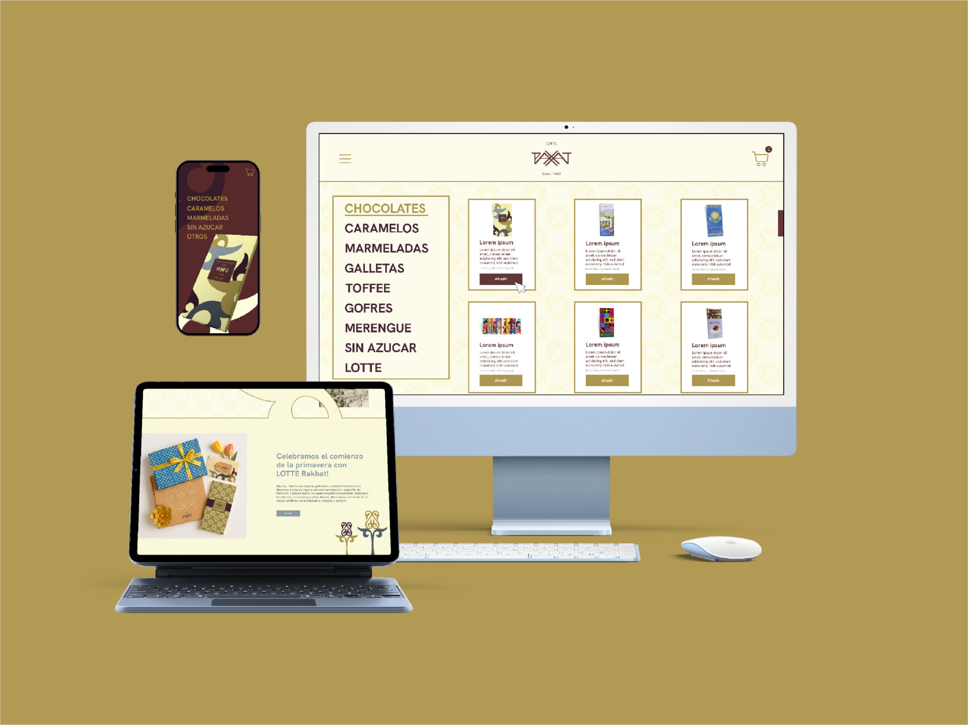
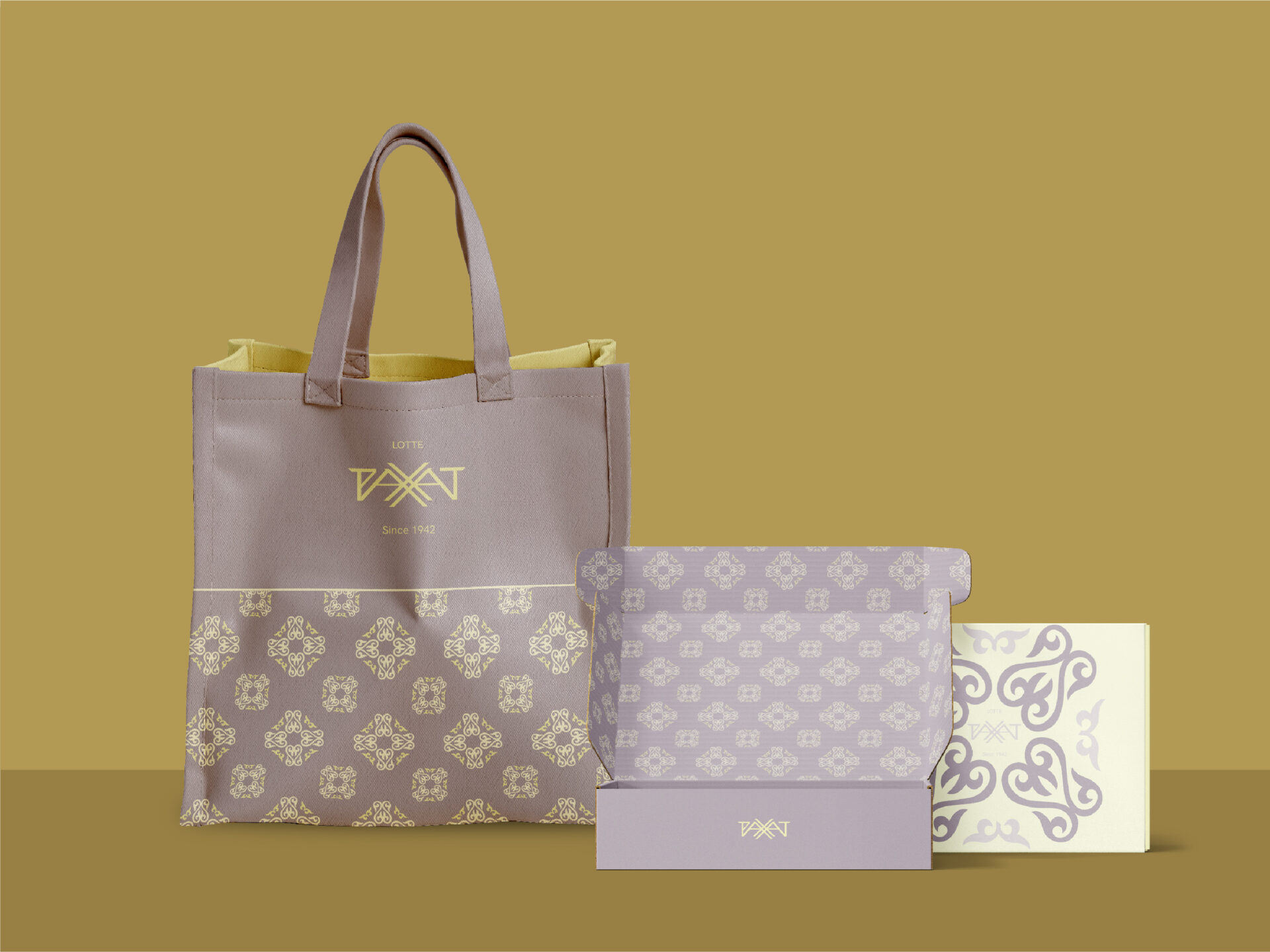
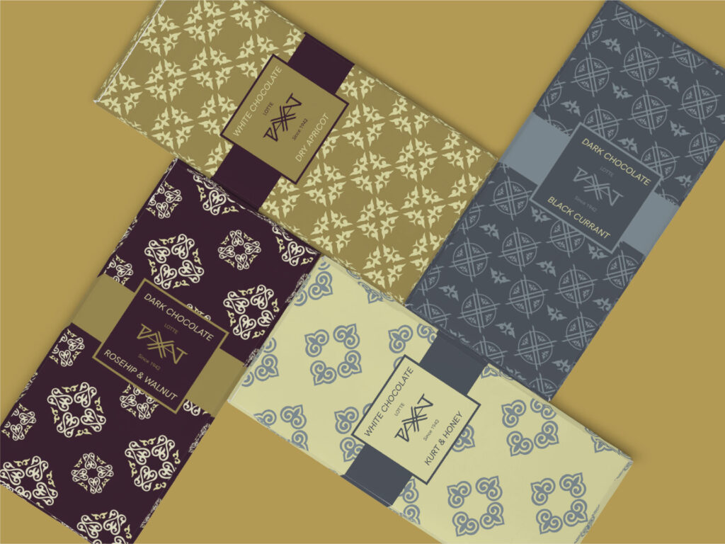
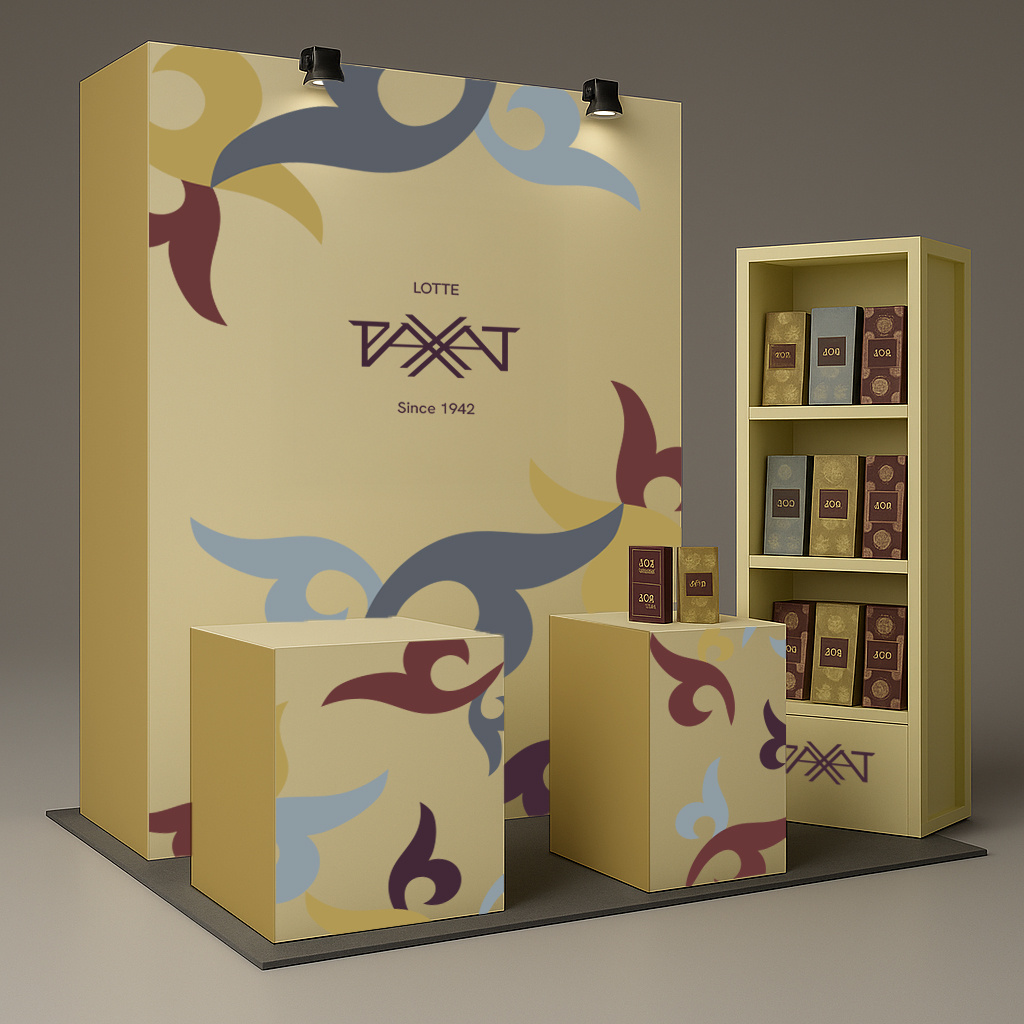
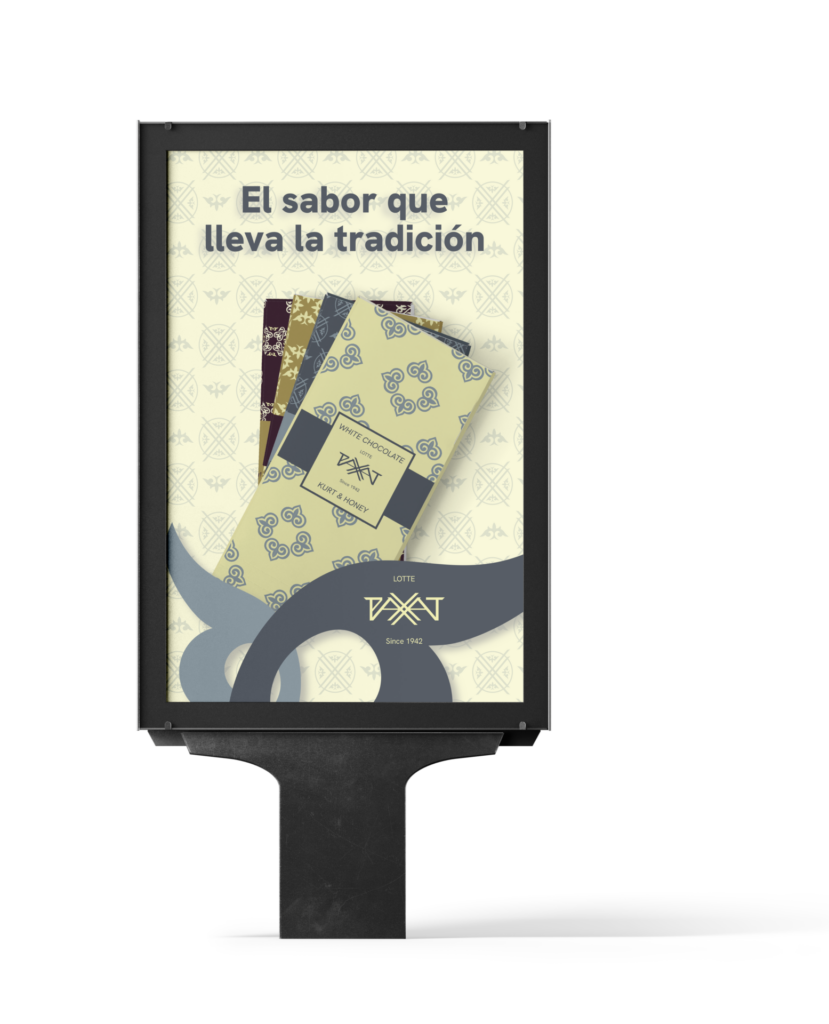
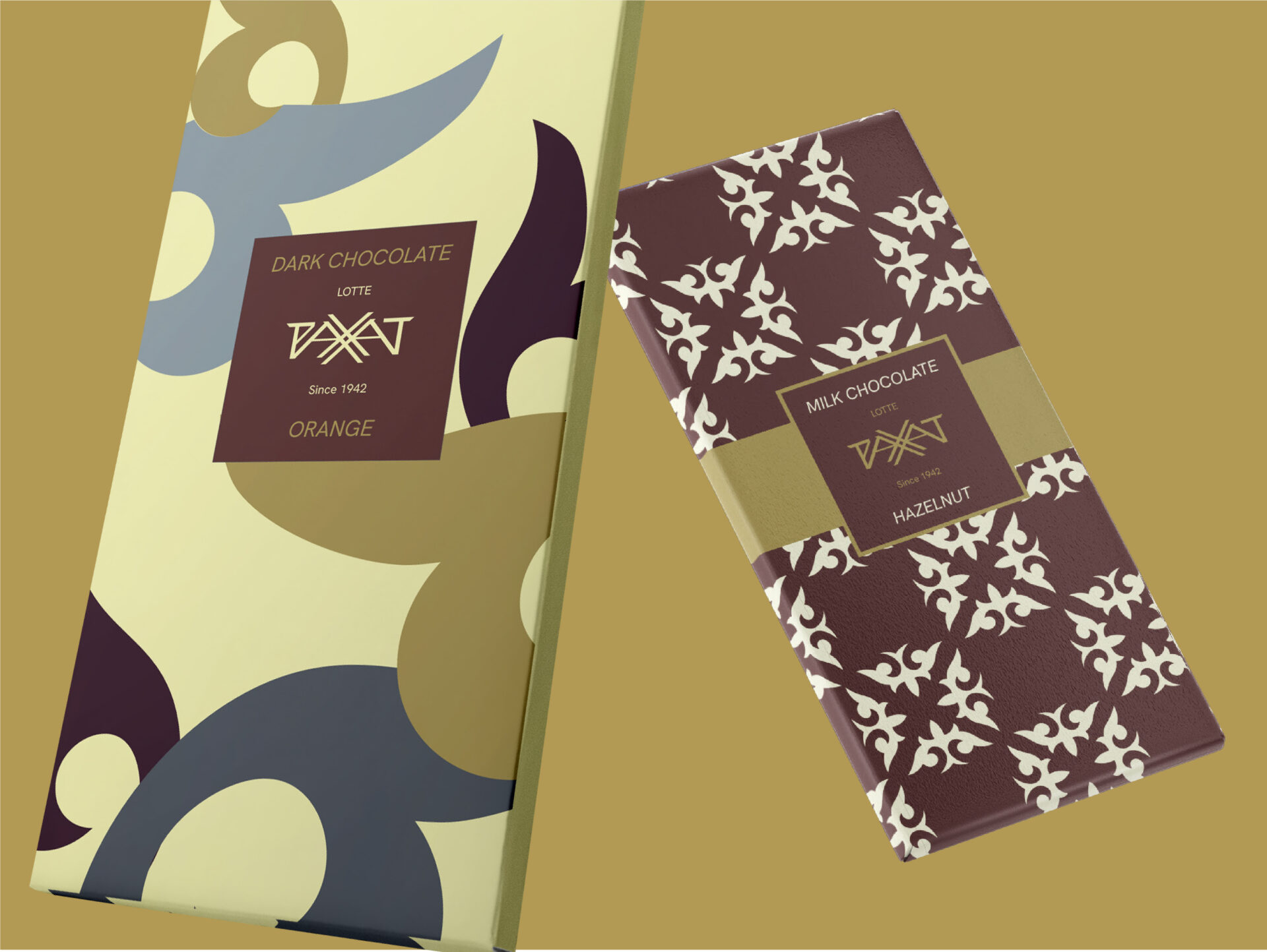
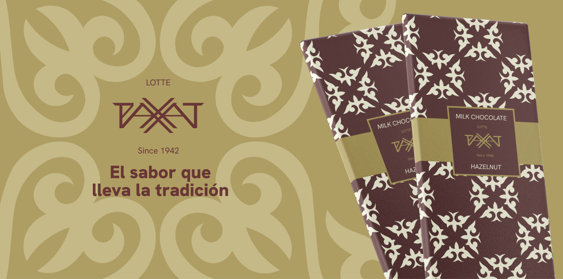
This work is a rebranding proposal developed as a Degree Final Project for the Kazakh confectionery brand LOTTE Rakhat. Rakhat is one of the leading confectionery manufacturers in Kazakhstan, widely known for its chocolates, candies, and traditional sweets. Until 1992, the company operated without a distinct visual identity. Following its privatization that year, the brand officially registered its name and introduced its first logotype.
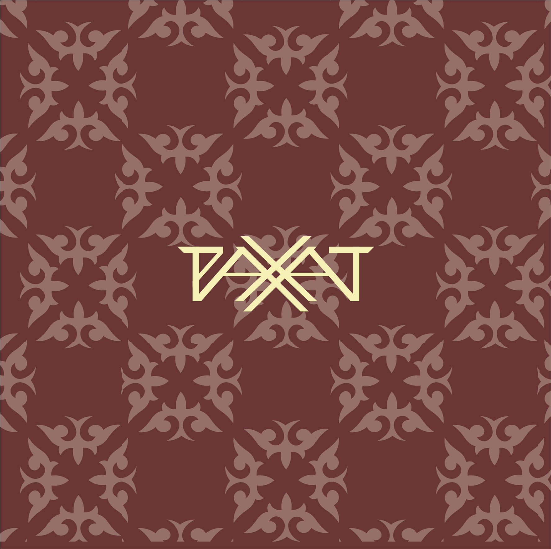
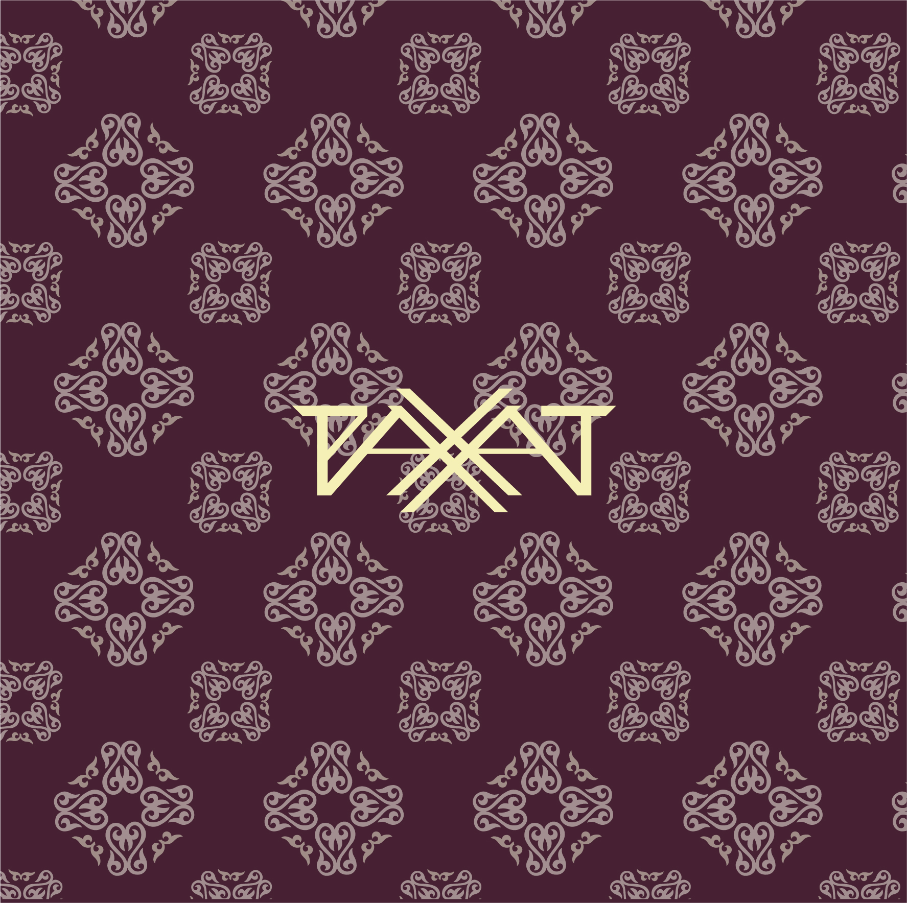
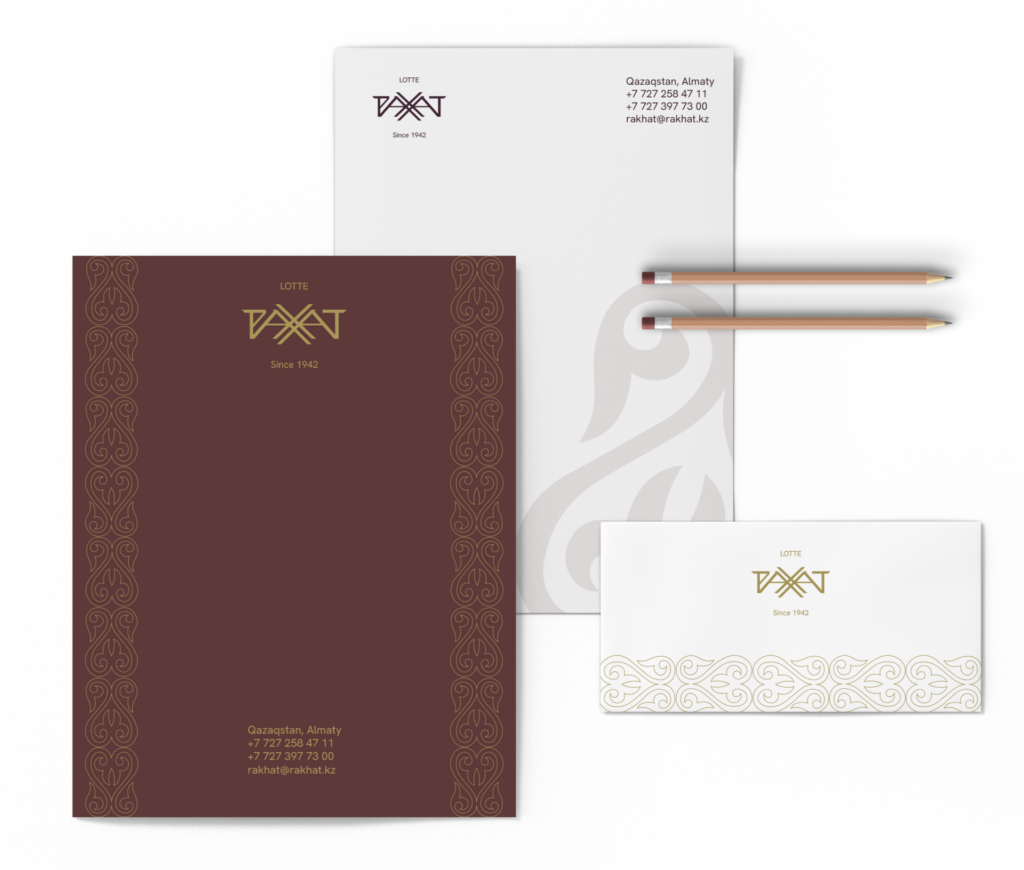
This visual identity remained essentially unchanged for more than 30 years. Over time, the lack of evolution in the brand’s image created a fictional need for renewal, forming the conceptual basis of this project. The rebranding proposal responds to this context by rethinking the visual identity to better reflect contemporary values and expectations while respecting the brand’s essence.