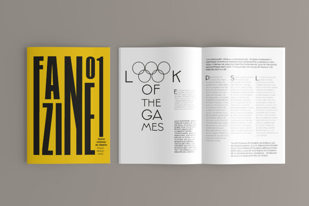
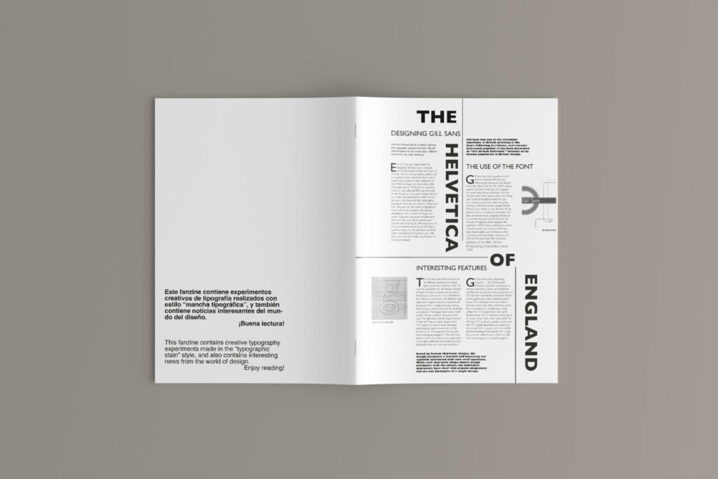
This project is a typography focused assignment developed for the creation of the first university fanzine. The publication was a collaborative work, bringing together articles designed by multiple students, with the main objective of communicating content using only typography as a visual tool. The challenge was to transform text into a creative and expressive element by experimenting with different typefaces, sizes, weights, and compositions.